The aim of this tutorial is to take you through the process of coloring an image in Photoshop using digital painting techniques. Being such a flexible piece of software, there are several ways to approach this task, each with its merits. Concept artists will often work in grayscale for their base and apply color on top, which is a great method. The method I’m going to demonstrate in this tutorial uses a regular color base, and the shading is done with Hue Saturation layers. This method enables easy modification of color values and frees you up from worrying about any existing color values in your image while shading. To achieve that aim, we’ll be working a lot with the Hue/Saturation adjustment layer.
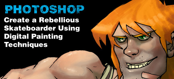
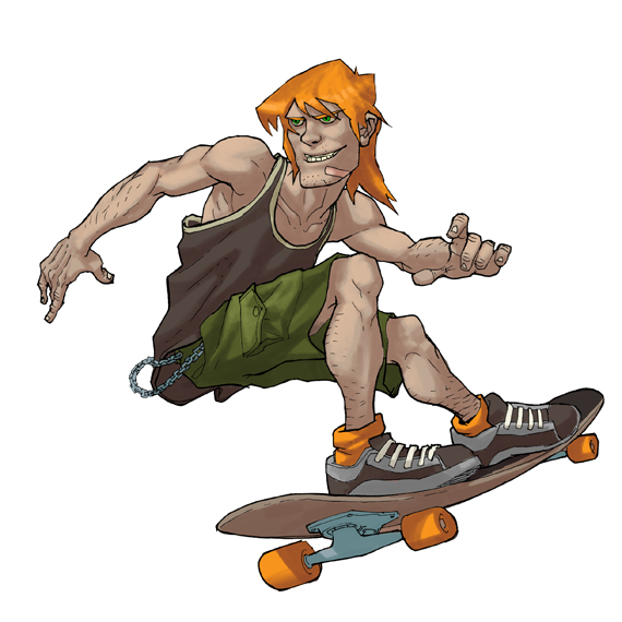
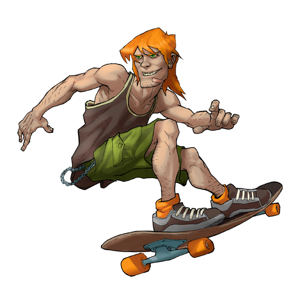
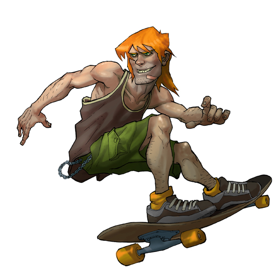
Rebellious Skateboarder
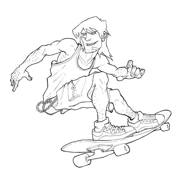
This is the image that we will be creating. You can download the source files for this tutorial here.

Preparation
You’ll need:
- A copy of Photoshop (preferable CS3 or greater)
- A sketch – you can use the scan provided in the source file or make your own.
- A Wacom tablet (any model is fine).
I have a collection of brushes I’ve accumulated over the last few years that I regularly use for Photoshop work – but I tend to use a very small subset of them for most of my work. You can download the brushes used in this tutorial here. They’re nothing special, just a variety of brush settings is all.
Brush 1: Sharp Edge Brush
This brush will be used to block out the main areas of the image

Brush Tip Shape:
- Hardness – 100%
- Spacing – 25%
Shape Dyamics:
- Size Jitter – Pen pressure
- Minimum Diameter – 0%;
Other Dyamics:
Brush 2: Detailing Brush
This brush is used, surprisingly, for details such as highlights

Brush Tip Shape:
- Hardness – 0%
- Spacing – 25%
Shape Dyamics:
- Size Jitter – Pen pressure
- Minimum Diameter – 0%;
Other Dyamics:
Brush 3: Soft Brush
This brush is used for some delicate ambient shading jobs

Brush Tip Shape:
- Hardness – 0%
- Spacing – 25%
Shape Dyamics:
- Size Jitter – Pen pressure
Other Dyamics:
Brush 4: Pallette Knife Brush
This is the heavy lifter in the tutorial – the main thing to note about it is that the Angle Jitter is set to direction, to make the brush angle track with the direction of motion. It uses an image as it’s base – but it’s pretty basic, just a circle blurred laterally.

This brush uses a graphic – it’s a simple ellipse blurred slightly in the X axis:
Brush Tip Shape:
Shape Dyamics:
- Size Jitter – Pen pressure
- Minimum Diameter – 0%;
- Angle Jitter – Direction
Other Dyamics:
Tip: While paying attention to the brushes you draw with, pay equal attention to the brushes you erase with. A general rule of thumb is always erase with the same brush you use to draw.
Step 1: Prep the Artwork
Ok, we’re all set. First , we need to ink the artwork. I tend to use layout pads for work like this, it’s ideal for making adjustments and tracings. I ink on a separate sheet to preserve the original sketch. Try to be tidy, it’ll only cause you more work later if you rush.
How you ink the drawing is entirely up to you. Inking is a whole art form in itself, but here I’ve gone for some fairly simple inking – the sketch is rendered first using a 0.5mm pen, and then a fatter outline is made with a 0.8mm, with an eye to emphasise the main elements of the form. Scan the artwork in using gray scale – you don’t want any color artefacts in your line work.
Switch to the Sharp brush, and try to clean up the artwork, removing any unwanted artefact or mistakes you made while inking. I actually sometimes use this phase to completely rework a component. In fact, I completely redrew the face at this stage – I felt that the original was a bit bland. Try to ensure that the outline of the overall form is closed, this will be important in step 2.
Tip: Set the background color to white, foreground to black. As you’re working round the image, use x to switch between white and black. The image will be used as a multiply layer, so any white will be transparent anyway – so it’s slightly quicker than moving between the eraser and brush all the time.
Step 2: Block Out the color
Now we need to block out the color for the drawing. Click on the magic wand tool, and make sure it’s tolerance is set to 64.

Select the white space outside the figure. If the outline is closed, it will make a nice solid selection. Any openings will allow the magic wand to leak inside the figure – if that’s the case, take another look and try to close any openings in the outline. You can create the first block of color using the lasso tool, but that can get real tedious.
Assuming you have a clean silhouetted selection, hit CTRL+Shift+i. This will invert the selection. Create a new layer, and fill the selection with your base skin tone. Make sure the line art is at the top layer of the document, and set its blending mode to “Multiply”.Now, create a folder and pop the new color layer inside it. CTRL+click on this layer to create a selection, and create a mask on the folder using this selection area. This will guarantee that you don’t color in outside the lines!
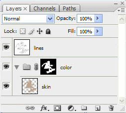
Step back inside the folder, and create a new layer for each component of the model, applying color as you go – e.g: a new layer for the shorts, new layer for t-shirt etc. Some of these layers will get merged into one later, but for the sake of simplicity, make a new layer each time. Work down through large areas of color to smaller. This will reduce the need to worry about overlapping areas. You can sometimes do several components at once if they have a common “theme” – so I tend to group all metallic parts into one layer, and all details into another layer.
The actual colors you choose at this stage are not so important; you can easily adjust these colors at the end of this stage.
Once you’re done, take a quick once over, make sure your colors are neatly applied. Make any tonal adjustments now if you wish – and collapse any layers together you think are too trivial to merit a separate layer.
Tip: At this stage, I would advise you to go through your layers and NAME them. It can be really helpful when working with the document – but is generally good practice to get into. There’s a certain joy in opening a flat PSD comprised of 200 un-named layers. Try to group layers in folders, and apply colors to the folders to increase layer readability.
Step 3: Apply Basic Shading
2 down! Now for the fun part. Photoshop provides lots of options for shading artwork. You could hand pick colors in the traditional fashion, or use overlays/transparencies of color. The method I’m going to show you now is one I derived from my work as a texture artist in the video games industry. All too often there would be a last minute change to a texture, or multiple variations required for a multiplayer mod. This method allows you great flexibility, so you can change color values easily as you progress.
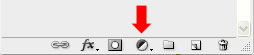
Create a new folder called “Shading”. Apply the same masking technique we used for the color folder. Within this folder create a sub folder called “Dark”. Create a new Hue/Saturation layer in this folder. You can make one by clicking on the black and white button at the bottom of the layers panel
Slide the lightness down by about a third, move the saturation up by about a quarter, and nudge the hue left or right slightly. This last part ensures that your shading doesn’t become too “monochromatic” and gives the image more body. (Taking a hint from the old masters, you want to try and alternate your layers of shading through cold/warm variations). The whole image will appear dark. Set the background swatch to black, hit CTRL+A and then CTRL+X to clear the layer of information.
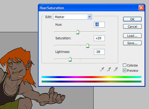
Select your Palette Brush and, setting the foreground swatch to white, begin working in to the image. I love working with this brush, it’s directional nature is really “tactile” and you can get very involved sculpting the form out with shadow. I like the way that it lends itself to creating strong geometric forms as you shade.
Work over the entire figure applying a medium level of shading. As you can see, the shading technique will nudge the existing color down and across slightly – thus bypassing the need to keep manually selecting colors relevant to the base, while the slight hue adjustment prevents the shading from being too tonally flat. There is one caveat to this technique. If you have used the hue slider to push the color towards red (for example), the layer will struggle to apply the effect to that colors complementary. In contrast, it will be really strong if you apply the shading to the color’s analogue or the same color. That being the case, you might have to make a couple of additional HS layers to accommodate this problem. Overall however, this technique is pretty fast.
Once you’re done with the dark shading, make a new layer doing the same for light – experiment with the hue/saturation settings to get a nice value across as much of the image as possible.
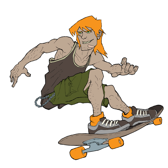
Step 4: Finishing Touches
All things being good, you should now have a relatively nicely shaded image. Now for some finishing touches. Create another darker HS layer, and select your Soft brush. We’re going to apply some “ambient” shadow, picking out some softer shadows to emphasise the form. You don’t need to get too specific with this level of shading. Do the same with a light layer.
Create a new standard layer, but move it ABOVE the line artwork. This will allow us to apply some nice highlights to the image. I like to use a very light yellow for this job – picking out fine details like the shine in the eyes, or on the bridge of the nose. Use the Fine Detail brush for sharp edges or highlights, and the Soft brush for broad soft areas like the shoulder muscles.
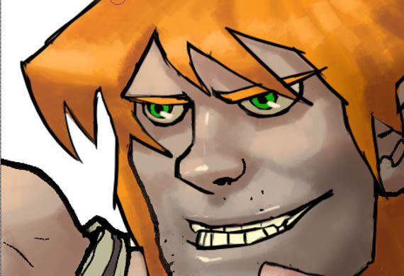
Next I want to try and add a little bit of tonal variety. Using the lasso tool, select an area around the chin where the beard would grow on the character. Create a new HS layer, and drop the lightness and saturation values slightly. Apply a Gaussian blur filter to this layer.
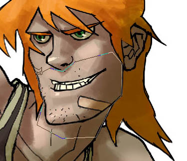
Create another HS layer, and focus on making a more ruddy skin tone. Clear the layer again, and use the soft brush to apply a the redder skin tone to key areas like the cheeks, nose, knees and fingers.
I grabbed a swatch of camo of the internet and applied it to the shorts layer. This is primarily to demonstrate a point about the advantage of this method, in that you don’t need to worry about any color values in the underlying image. Working with HS layers takes care of that for you.
Finally, I create one last HS layer, above all the shading but beneath the color, drop the light values and nudge the color in the general opposite direction of the dominant color in the image. Apply a simply linear gradient to this layer, and it adds that last little touch that emphasises the direction of light.
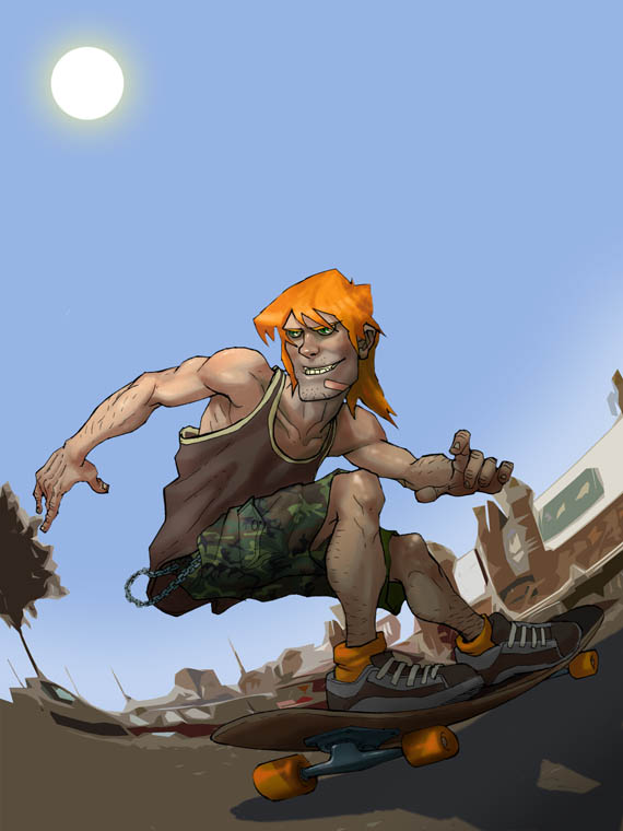
I have to confess to a little cheating in this next step – to create a simple background I popped out to the local retail park and took some photos low to the deck. I then applied a spherical distortion filter, and applied a cutout filter to simplify the image. Finally, I made a little sun using a white circle selection with an outer glow filter – and added a dark orange soft-light layer to the backdrop to unify and warm the color slightly.
Conclusion
So, to round up – this tutorial has hopefully shown you some interesting methods using HS layers. The joy about this method is that you are effectively painting a black and white image – which adapts itself to any underlying color information. It’s fast and versatile – and that’s just the HS layer!! Try the same trick with some of the other adjustment layer types to see what you can come up with!
You may download the source files for this tutorial below. The contents of the download however are for educational purposes only and cannot be used for personal or commercial use, sold, or redistributed without the expressed consent of Colorburned Creative.
File type: .ai
Compatibility: Adobe Illustrator
Size: 10.47 MB

The aim of this tutorial is to take you through the process of coloring an image in Photoshop using digital painting techniques. Being such a flexible piece of software, there are several ways to approach this task, each with its merits. Concept artists will often work in grayscale for their base and apply color on top, which is a great method. The method I’m going to demonstrate in this tutorial uses a regular color base, and the shading is done with Hue Saturation layers. This method enables easy modification of color values and frees you up from worrying about any existing color values in your image while shading. To achieve that aim, we’ll be working a lot with the Hue/Saturation adjustment layer.
Rebellious Skateboarder
This is the image that we will be creating. You can download the source files for this tutorial here.
Preparation
You’ll need:
I have a collection of brushes I’ve accumulated over the last few years that I regularly use for Photoshop work – but I tend to use a very small subset of them for most of my work. You can download the brushes used in this tutorial here. They’re nothing special, just a variety of brush settings is all.
Brush 1: Sharp Edge Brush
This brush will be used to block out the main areas of the image
Brush Tip Shape:
Shape Dyamics:
Other Dyamics:
Brush 2: Detailing Brush
This brush is used, surprisingly, for details such as highlights
Brush Tip Shape:
Shape Dyamics:
Other Dyamics:
Brush 3: Soft Brush
This brush is used for some delicate ambient shading jobs
Brush Tip Shape:
Shape Dyamics:
Other Dyamics:
Brush 4: Pallette Knife Brush
This is the heavy lifter in the tutorial – the main thing to note about it is that the Angle Jitter is set to direction, to make the brush angle track with the direction of motion. It uses an image as it’s base – but it’s pretty basic, just a circle blurred laterally.
This brush uses a graphic – it’s a simple ellipse blurred slightly in the X axis:
Brush Tip Shape:
Shape Dyamics:
Other Dyamics:
Tip: While paying attention to the brushes you draw with, pay equal attention to the brushes you erase with. A general rule of thumb is always erase with the same brush you use to draw.
Step 1: Prep the Artwork
Ok, we’re all set. First , we need to ink the artwork. I tend to use layout pads for work like this, it’s ideal for making adjustments and tracings. I ink on a separate sheet to preserve the original sketch. Try to be tidy, it’ll only cause you more work later if you rush.
How you ink the drawing is entirely up to you. Inking is a whole art form in itself, but here I’ve gone for some fairly simple inking – the sketch is rendered first using a 0.5mm pen, and then a fatter outline is made with a 0.8mm, with an eye to emphasise the main elements of the form. Scan the artwork in using gray scale – you don’t want any color artefacts in your line work.
Switch to the Sharp brush, and try to clean up the artwork, removing any unwanted artefact or mistakes you made while inking. I actually sometimes use this phase to completely rework a component. In fact, I completely redrew the face at this stage – I felt that the original was a bit bland. Try to ensure that the outline of the overall form is closed, this will be important in step 2.
Tip: Set the background color to white, foreground to black. As you’re working round the image, use x to switch between white and black. The image will be used as a multiply layer, so any white will be transparent anyway – so it’s slightly quicker than moving between the eraser and brush all the time.
Step 2: Block Out the color
Now we need to block out the color for the drawing. Click on the magic wand tool, and make sure it’s tolerance is set to 64.
Select the white space outside the figure. If the outline is closed, it will make a nice solid selection. Any openings will allow the magic wand to leak inside the figure – if that’s the case, take another look and try to close any openings in the outline. You can create the first block of color using the lasso tool, but that can get real tedious.
Assuming you have a clean silhouetted selection, hit CTRL+Shift+i. This will invert the selection. Create a new layer, and fill the selection with your base skin tone. Make sure the line art is at the top layer of the document, and set its blending mode to “Multiply”.Now, create a folder and pop the new color layer inside it. CTRL+click on this layer to create a selection, and create a mask on the folder using this selection area. This will guarantee that you don’t color in outside the lines!
Step back inside the folder, and create a new layer for each component of the model, applying color as you go – e.g: a new layer for the shorts, new layer for t-shirt etc. Some of these layers will get merged into one later, but for the sake of simplicity, make a new layer each time. Work down through large areas of color to smaller. This will reduce the need to worry about overlapping areas. You can sometimes do several components at once if they have a common “theme” – so I tend to group all metallic parts into one layer, and all details into another layer.
The actual colors you choose at this stage are not so important; you can easily adjust these colors at the end of this stage.
Once you’re done, take a quick once over, make sure your colors are neatly applied. Make any tonal adjustments now if you wish – and collapse any layers together you think are too trivial to merit a separate layer.
Tip: At this stage, I would advise you to go through your layers and NAME them. It can be really helpful when working with the document – but is generally good practice to get into. There’s a certain joy in opening a flat PSD comprised of 200 un-named layers. Try to group layers in folders, and apply colors to the folders to increase layer readability.
Step 3: Apply Basic Shading
2 down! Now for the fun part. Photoshop provides lots of options for shading artwork. You could hand pick colors in the traditional fashion, or use overlays/transparencies of color. The method I’m going to show you now is one I derived from my work as a texture artist in the video games industry. All too often there would be a last minute change to a texture, or multiple variations required for a multiplayer mod. This method allows you great flexibility, so you can change color values easily as you progress.
Create a new folder called “Shading”. Apply the same masking technique we used for the color folder. Within this folder create a sub folder called “Dark”. Create a new Hue/Saturation layer in this folder. You can make one by clicking on the black and white button at the bottom of the layers panel
Slide the lightness down by about a third, move the saturation up by about a quarter, and nudge the hue left or right slightly. This last part ensures that your shading doesn’t become too “monochromatic” and gives the image more body. (Taking a hint from the old masters, you want to try and alternate your layers of shading through cold/warm variations). The whole image will appear dark. Set the background swatch to black, hit CTRL+A and then CTRL+X to clear the layer of information.
Select your Palette Brush and, setting the foreground swatch to white, begin working in to the image. I love working with this brush, it’s directional nature is really “tactile” and you can get very involved sculpting the form out with shadow. I like the way that it lends itself to creating strong geometric forms as you shade.
Work over the entire figure applying a medium level of shading. As you can see, the shading technique will nudge the existing color down and across slightly – thus bypassing the need to keep manually selecting colors relevant to the base, while the slight hue adjustment prevents the shading from being too tonally flat. There is one caveat to this technique. If you have used the hue slider to push the color towards red (for example), the layer will struggle to apply the effect to that colors complementary. In contrast, it will be really strong if you apply the shading to the color’s analogue or the same color. That being the case, you might have to make a couple of additional HS layers to accommodate this problem. Overall however, this technique is pretty fast.
Once you’re done with the dark shading, make a new layer doing the same for light – experiment with the hue/saturation settings to get a nice value across as much of the image as possible.
Step 4: Finishing Touches
All things being good, you should now have a relatively nicely shaded image. Now for some finishing touches. Create another darker HS layer, and select your Soft brush. We’re going to apply some “ambient” shadow, picking out some softer shadows to emphasise the form. You don’t need to get too specific with this level of shading. Do the same with a light layer.
Create a new standard layer, but move it ABOVE the line artwork. This will allow us to apply some nice highlights to the image. I like to use a very light yellow for this job – picking out fine details like the shine in the eyes, or on the bridge of the nose. Use the Fine Detail brush for sharp edges or highlights, and the Soft brush for broad soft areas like the shoulder muscles.
Next I want to try and add a little bit of tonal variety. Using the lasso tool, select an area around the chin where the beard would grow on the character. Create a new HS layer, and drop the lightness and saturation values slightly. Apply a Gaussian blur filter to this layer.
Create another HS layer, and focus on making a more ruddy skin tone. Clear the layer again, and use the soft brush to apply a the redder skin tone to key areas like the cheeks, nose, knees and fingers.
I grabbed a swatch of camo of the internet and applied it to the shorts layer. This is primarily to demonstrate a point about the advantage of this method, in that you don’t need to worry about any color values in the underlying image. Working with HS layers takes care of that for you.
Finally, I create one last HS layer, above all the shading but beneath the color, drop the light values and nudge the color in the general opposite direction of the dominant color in the image. Apply a simply linear gradient to this layer, and it adds that last little touch that emphasises the direction of light.
I have to confess to a little cheating in this next step – to create a simple background I popped out to the local retail park and took some photos low to the deck. I then applied a spherical distortion filter, and applied a cutout filter to simplify the image. Finally, I made a little sun using a white circle selection with an outer glow filter – and added a dark orange soft-light layer to the backdrop to unify and warm the color slightly.
Conclusion
So, to round up – this tutorial has hopefully shown you some interesting methods using HS layers. The joy about this method is that you are effectively painting a black and white image – which adapts itself to any underlying color information. It’s fast and versatile – and that’s just the HS layer!! Try the same trick with some of the other adjustment layer types to see what you can come up with!
You may download the source files for this tutorial below. The contents of the download however are for educational purposes only and cannot be used for personal or commercial use, sold, or redistributed without the expressed consent of Colorburned Creative.
File type: .ai
Compatibility: Adobe Illustrator
Size: 10.47 MB
adminlogo