When you create a print advertisement, it’s important that all the elements of your composition are geared towards selling a product and promoting a brand. Today, we will demonstrate how to create a refreshing beer-themed poster design in Photoshop.
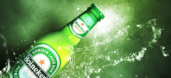
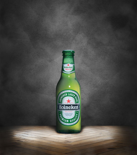
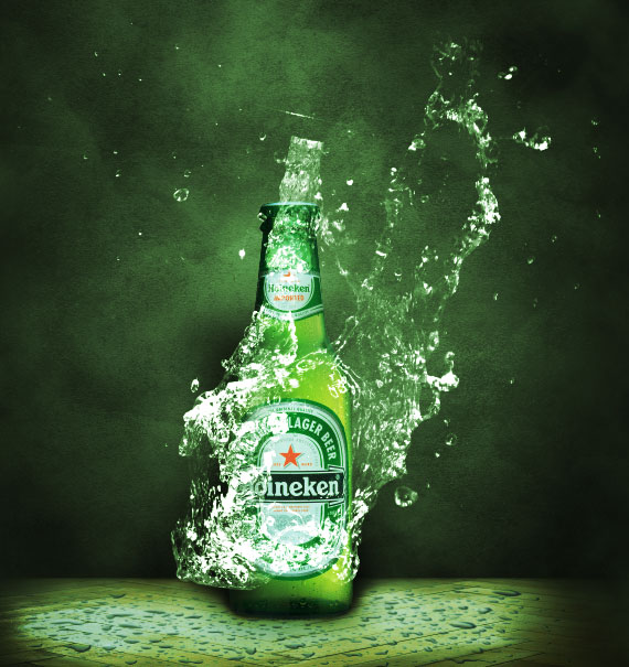
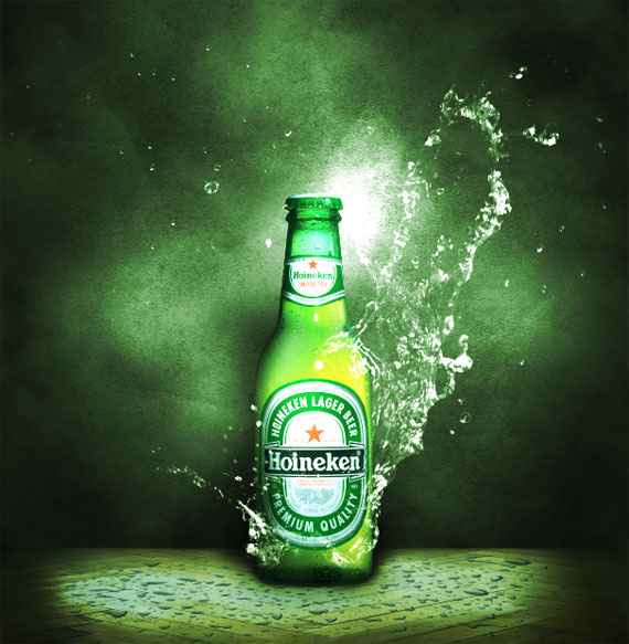
Final Image Preview
Take a look at what we will be creating.

Tutorial Details
- Program: Adobe Photoshop
- Difficulty: Intermediate
- Estimated Completion Time: 3 Hours
Resources Used
The following resources were used during the production of this tutorial.
Step 1
Let’s start by creating a new A4 document in Photoshop. Working with large files allows you to zoom in and focus your attention on small details, that can make the difference between a good and great design.

Step 2
Right-click on the background layer, in the layer palette, and apply a radial gradient using layer styles. Set the gradient from a #464646 to #202020.

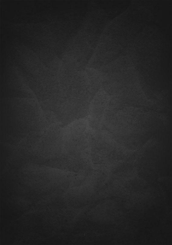
Step 3
Download the grunge texture and drag it onto your canvas. Press Cmd/Ctrl + Shift + U to desaturate it and switch the layer blend mode to overlay with opacity 30%.
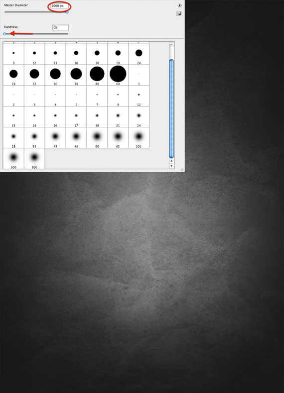
Step 4
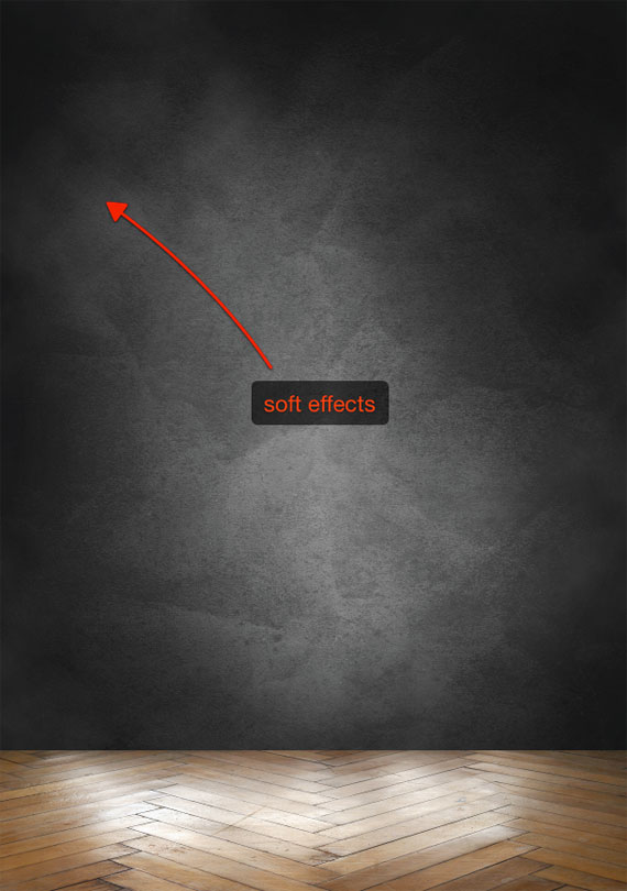
Create a new layer between the background and the texture, grab a white soft (hardness 0%) brush, and paint some spots over the center of the canvas. Reduce the opacity until you’ve obtained a subtle light effect in the center.
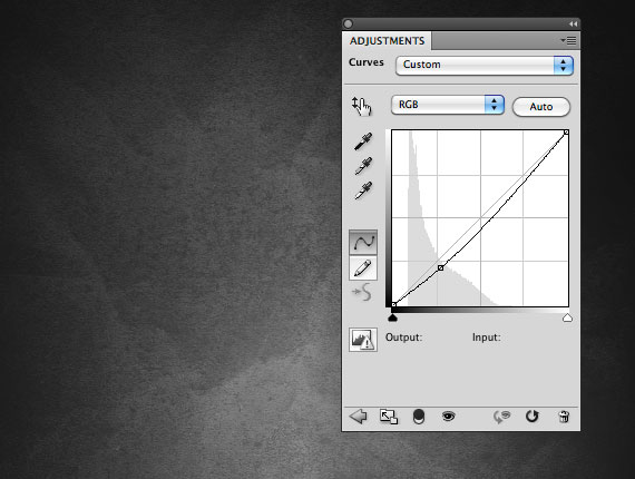
Step 5
At this point I think the background is too light. A layer adjustment can help. Go to Layer > New Adjustment Layers > Curves and put this layer at the top of the others. Create an anchor point on the curve and move it to the bottom as shown on in the screenshot below:
Step 6
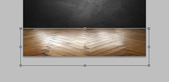
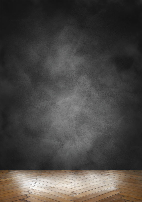
Select all the layers created and group them (Cmd/Ctrl + G). Title the group “background”. It’s time to create the floor where to place the bottle. Create a new group and title it “floor”. As I always write in my tutorials, organization is fundamental while working with lots of layers, as in this case. There’s nothing more irritating than spending your time searching for a layer among thousands of untitled layers!
Download and paste in the parquet image. Press Cmd/Ctrl + T to activate the transform tool and squash the image to create the idea of perspective:
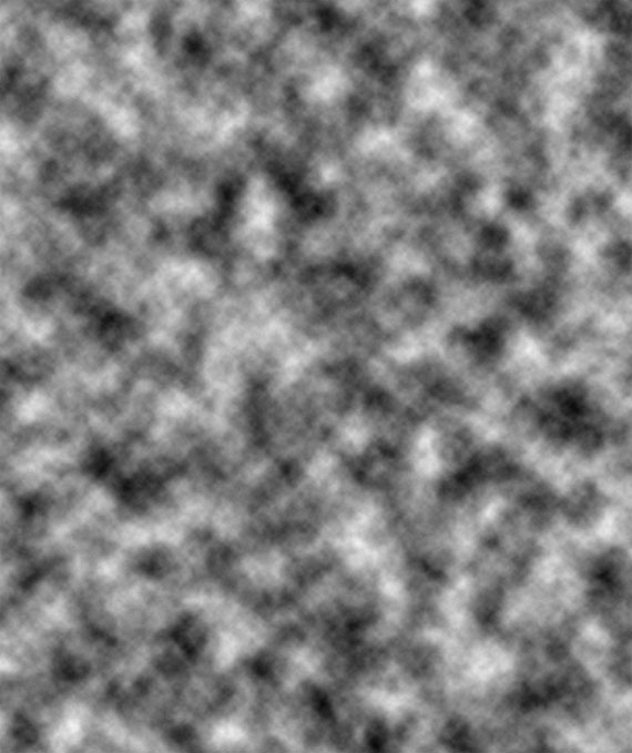
Create a new group and title it “clouds”. Create a new layer inside “clouds”, make sure to select black and white as the foreground and background color and go to Filter > Render > Clouds.
Step 8
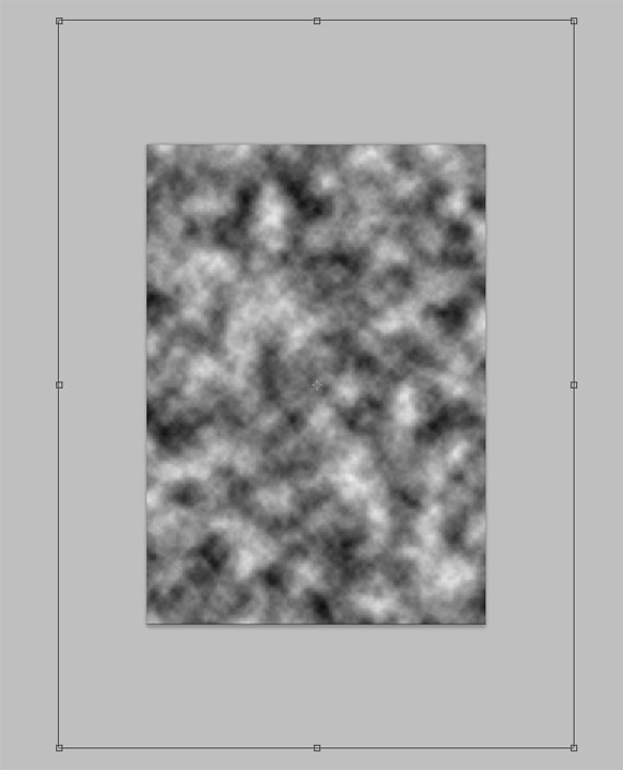
Press Cmd/Ctrl + T to enlarge the cloud layer.
Step 9
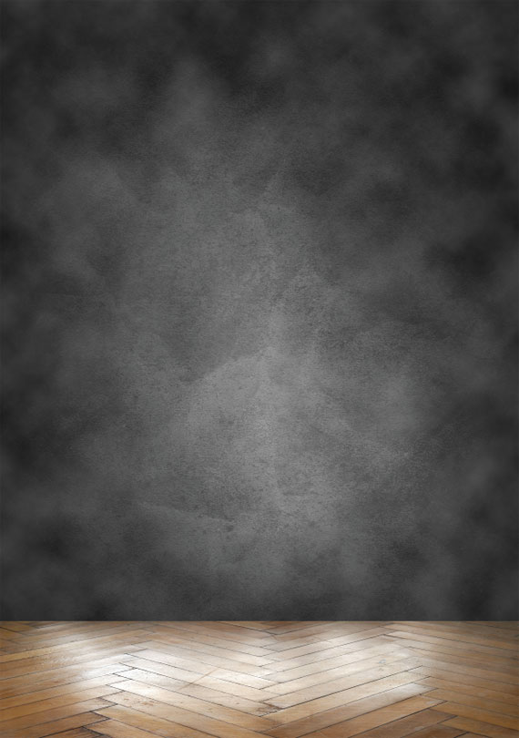
Now switch the layer blending mode to screen and reduce its opacity to 20%.
Step 10
Grab the Eraser tool (E) and use a large soft brush to erase some areas of the cloud layer, in particular over the corners.
Step 11
You can add more cloud layers, that can be removed at any time in case their effect is obtrusive. Here is my result:
Step 12
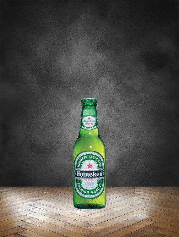
Create the “bottle” group and paste in an image of a beer bottle (Google it and you’ll find tons of free images).
Step 13
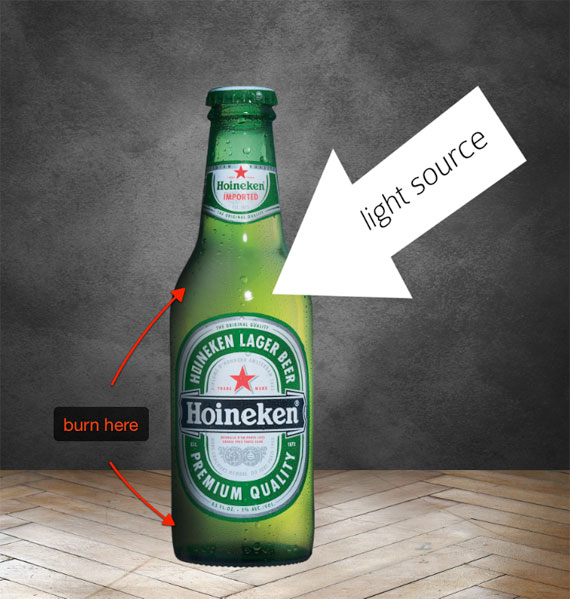
Realism can’t be achieved without a correct use of light. Let’s suppose our light source is in the top-right area (in front of the bottle). If you are unsure about how to create shadows, try experimenting with the lamp on your desk and any type of object. Since the light originates from the right, use the burn tool (O) to darken the left side of the bottle.
Step 14
Using the Burn tool, with range “midtones” and “exposure” 80%, select the floor layer and create a shadow effect below the bottle. Darken the corners too. These dark areas will drive user attention to the center where the product is.

Step 15
To darken the corners a bit more, create a new layer and use a large soft black brush to paint over these areas. You can then play with the layer’s opacity until you’re satisfied with the effect.
Step 16
Create a new layer between the floor and the grunge background. Using the same black brush from Step 15, paint where the floor meets the grunge wall. This will create a sensation of depth.
Step 17
Now paste the water droplets image onto the canvas in a layer above the floor. Make it the same size as the floor.
Step 18
Set the layer blending mode to “darken” with 70% opacity.
Step 19
Switch to the “bottle” group. Select the bottle layer and duplicate it (Cmd/Ctrl + J). Apply a black color over lay to the bottle using a layer style. This layer will be used to create the bottle shadow.
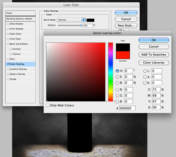
Step 20
Move the black bottle below the original. Press Cmd/Ctrl + T to activate the transform tool, then hold down Cmd/Ctrl and move the transform handles to add perspective to the shadow.

Step 21
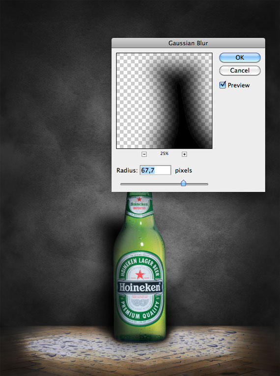
To complete the shadow, go to Filter > Blur > Gaussian Blur and enter a value of about 65 pixels. Reduce the opacity a little if you think it’s too strong.
Step 22
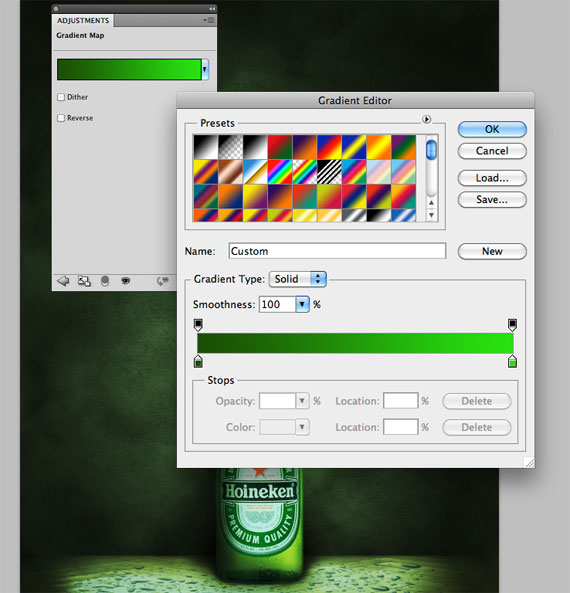
At this point we can play with colors. Cool colors will portray a sensation of freshness. Create a new gradient map layer (Layer > New Adjustment Layer > Gradient Map) and add a gradient going from #1b4f03 to #28e30f. Set the layer blend mode to overlay with an opacity of 50%. Keep in mind that this gradient map will be always be on top of all the other layers.
Step 23
Create a new layer above the bottle and name it “splash effects”. Open the first water splash image in Photoshop and double click on the background layer to unlock it.
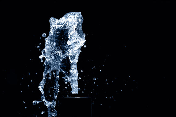
Step 24
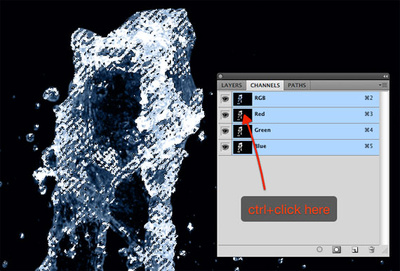
In the channels window (Window > Channels), Cmd/Ctrl + Click on the red channel thumbnail to select water pixels (choose the channel with the strongest contrast with the background).
Step 25
Press Cmd/Ctrl + C to copy the selection, switch to your working document and press Cmd/Ctrl + V to paste it.
Step 26
Set the layer blending mode to screen and use the Eraser tool (E) to eliminate unnecessary areas of the splash.
Step 27
Use the same technique with the other water splash to add more detail to the composition.
Step 28
Create a new group above and title it “light sposts”. Set the group blending mode to color dodge and create a layer inside the group. Grab a white soft brush and click once over a detail you want to enhance (i.e. in the top-right area, near the cork). reduce the opacity if the effect is too strong.

Step 29
Add more light effects, but create them on different layers to have more control.
Step 30
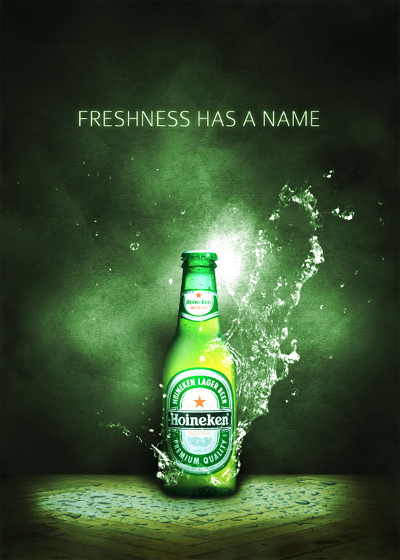
A nice slogan can help to reinforce the concept behind the design, even if it’s already evident from the image. In this case, I’ve opted for an elegant font, Colaborate, with a gentle outer glow, to create a simple yet useful text effect.
Step 31
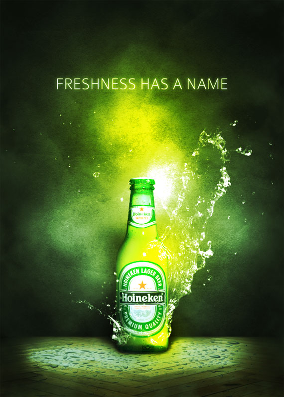
The composition is almost complete, but I think it needs some color adjustments. Create a new group immediately below the gradient map layer, and set the blending mode of the group to overlay. Create a layer inside the group, set a vivid yellow as foreground color, grab a soft brush and paint over the center area.
Step 32
Reduce the layer’s opacity to 20%.
Step 33
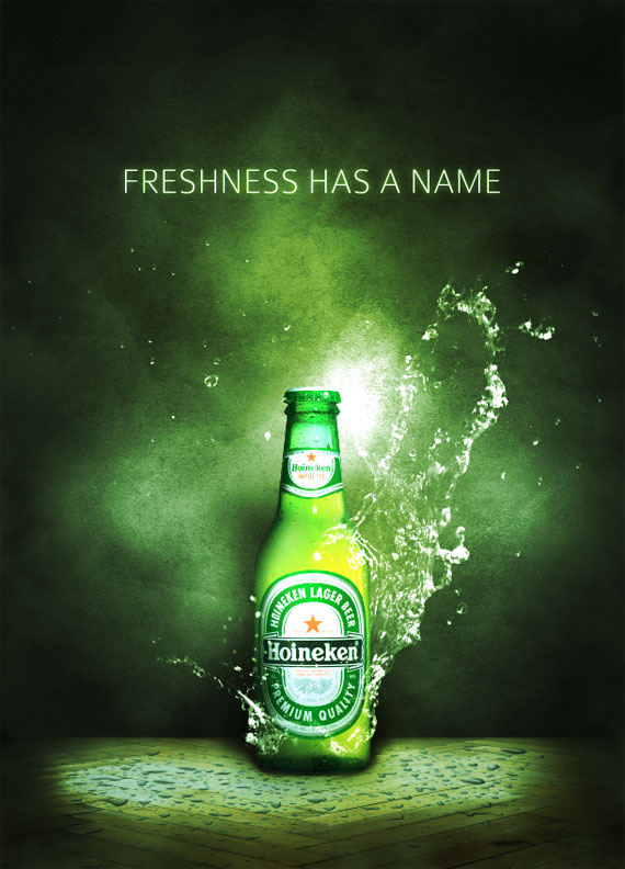
Create another layer and do the same, this time choose a bright blue and paint over the 4 corners.
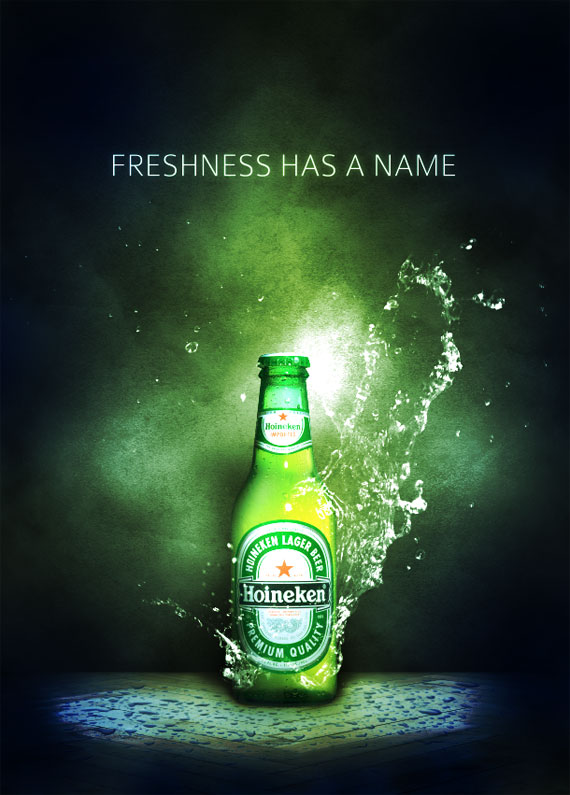
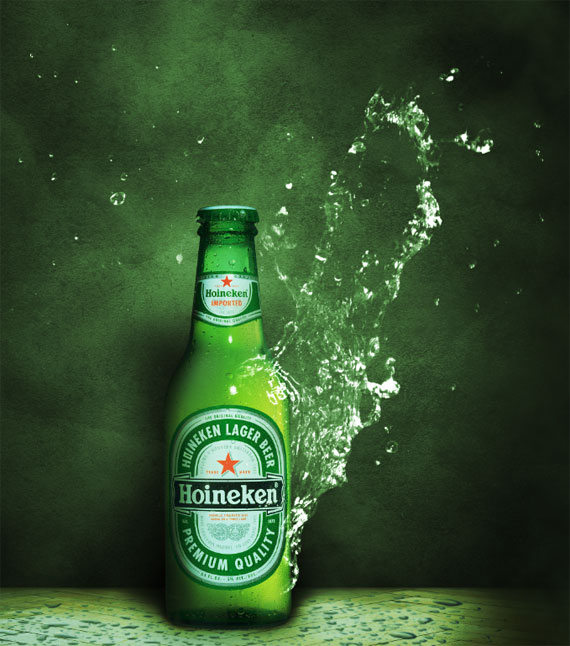
Final Image
Reduce the opacity to around 30% and you’re finished! I hope you’ve enjoyed this tutorial and learned some new tricks about advertisement design. Here is the final result.

When you create a print advertisement, it’s important that all the elements of your composition are geared towards selling a product and promoting a brand. Today, we will demonstrate how to create a refreshing beer-themed poster design in Photoshop.
Final Image Preview
Take a look at what we will be creating.
Tutorial Details
Resources Used
The following resources were used during the production of this tutorial.
Step 1
Let’s start by creating a new A4 document in Photoshop. Working with large files allows you to zoom in and focus your attention on small details, that can make the difference between a good and great design.
Step 2
Right-click on the background layer, in the layer palette, and apply a radial gradient using layer styles. Set the gradient from a #464646 to #202020.
Step 3
Download the grunge texture and drag it onto your canvas. Press Cmd/Ctrl + Shift + U to desaturate it and switch the layer blend mode to overlay with opacity 30%.
Step 4
Create a new layer between the background and the texture, grab a white soft (hardness 0%) brush, and paint some spots over the center of the canvas. Reduce the opacity until you’ve obtained a subtle light effect in the center.
Step 5
At this point I think the background is too light. A layer adjustment can help. Go to Layer > New Adjustment Layers > Curves and put this layer at the top of the others. Create an anchor point on the curve and move it to the bottom as shown on in the screenshot below:
Step 6
Select all the layers created and group them (Cmd/Ctrl + G). Title the group “background”. It’s time to create the floor where to place the bottle. Create a new group and title it “floor”. As I always write in my tutorials, organization is fundamental while working with lots of layers, as in this case. There’s nothing more irritating than spending your time searching for a layer among thousands of untitled layers!
Download and paste in the parquet image. Press Cmd/Ctrl + T to activate the transform tool and squash the image to create the idea of perspective:
Create a new group and title it “clouds”. Create a new layer inside “clouds”, make sure to select black and white as the foreground and background color and go to Filter > Render > Clouds.
Step 8
Press Cmd/Ctrl + T to enlarge the cloud layer.
Step 9
Now switch the layer blending mode to screen and reduce its opacity to 20%.
Step 10
Grab the Eraser tool (E) and use a large soft brush to erase some areas of the cloud layer, in particular over the corners.
Step 11
You can add more cloud layers, that can be removed at any time in case their effect is obtrusive. Here is my result:
Step 12
Create the “bottle” group and paste in an image of a beer bottle (Google it and you’ll find tons of free images).
Step 13
Realism can’t be achieved without a correct use of light. Let’s suppose our light source is in the top-right area (in front of the bottle). If you are unsure about how to create shadows, try experimenting with the lamp on your desk and any type of object. Since the light originates from the right, use the burn tool (O) to darken the left side of the bottle.
Step 14
Using the Burn tool, with range “midtones” and “exposure” 80%, select the floor layer and create a shadow effect below the bottle. Darken the corners too. These dark areas will drive user attention to the center where the product is.
Step 15
To darken the corners a bit more, create a new layer and use a large soft black brush to paint over these areas. You can then play with the layer’s opacity until you’re satisfied with the effect.
Step 16
Create a new layer between the floor and the grunge background. Using the same black brush from Step 15, paint where the floor meets the grunge wall. This will create a sensation of depth.
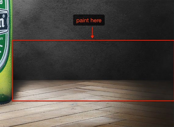
Step 17
Now paste the water droplets image onto the canvas in a layer above the floor. Make it the same size as the floor.
Step 18
Set the layer blending mode to “darken” with 70% opacity.
Step 19
Switch to the “bottle” group. Select the bottle layer and duplicate it (Cmd/Ctrl + J). Apply a black color over lay to the bottle using a layer style. This layer will be used to create the bottle shadow.
Step 20
Move the black bottle below the original. Press Cmd/Ctrl + T to activate the transform tool, then hold down Cmd/Ctrl and move the transform handles to add perspective to the shadow.
Step 21
To complete the shadow, go to Filter > Blur > Gaussian Blur and enter a value of about 65 pixels. Reduce the opacity a little if you think it’s too strong.
Step 22
At this point we can play with colors. Cool colors will portray a sensation of freshness. Create a new gradient map layer (Layer > New Adjustment Layer > Gradient Map) and add a gradient going from #1b4f03 to #28e30f. Set the layer blend mode to overlay with an opacity of 50%. Keep in mind that this gradient map will be always be on top of all the other layers.
Step 23
Create a new layer above the bottle and name it “splash effects”. Open the first water splash image in Photoshop and double click on the background layer to unlock it.
Step 24
In the channels window (Window > Channels), Cmd/Ctrl + Click on the red channel thumbnail to select water pixels (choose the channel with the strongest contrast with the background).
Step 25
Press Cmd/Ctrl + C to copy the selection, switch to your working document and press Cmd/Ctrl + V to paste it.
Step 26
Set the layer blending mode to screen and use the Eraser tool (E) to eliminate unnecessary areas of the splash.
Step 27
Use the same technique with the other water splash to add more detail to the composition.
Step 28
Create a new group above and title it “light sposts”. Set the group blending mode to color dodge and create a layer inside the group. Grab a white soft brush and click once over a detail you want to enhance (i.e. in the top-right area, near the cork). reduce the opacity if the effect is too strong.
Step 29
Add more light effects, but create them on different layers to have more control.
Step 30
A nice slogan can help to reinforce the concept behind the design, even if it’s already evident from the image. In this case, I’ve opted for an elegant font, Colaborate, with a gentle outer glow, to create a simple yet useful text effect.
Step 31
The composition is almost complete, but I think it needs some color adjustments. Create a new group immediately below the gradient map layer, and set the blending mode of the group to overlay. Create a layer inside the group, set a vivid yellow as foreground color, grab a soft brush and paint over the center area.
Step 32
Reduce the layer’s opacity to 20%.
Step 33
Create another layer and do the same, this time choose a bright blue and paint over the 4 corners.
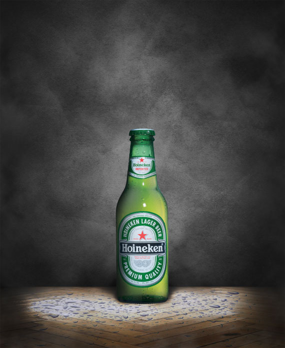
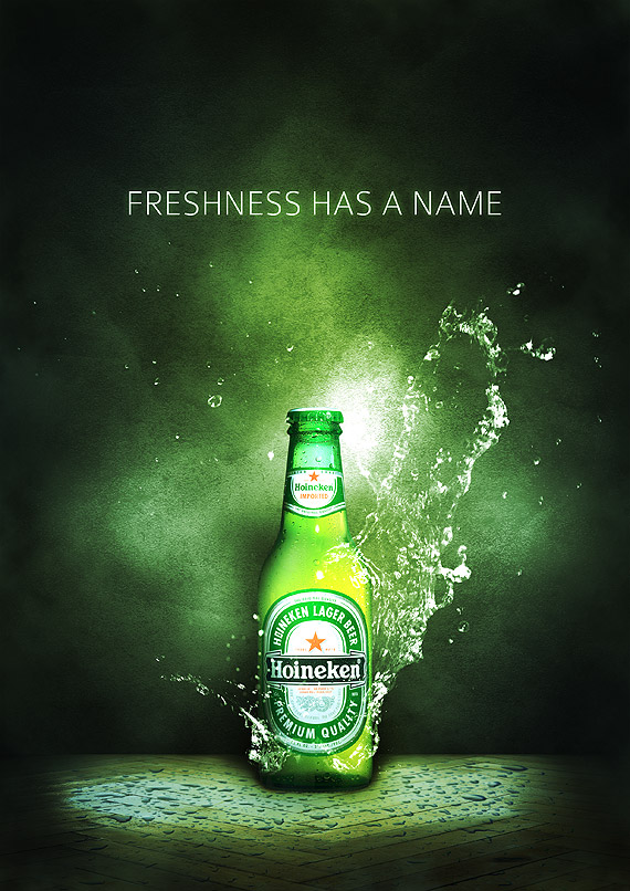
Final Image
Reduce the opacity to around 30% and you’re finished! I hope you’ve enjoyed this tutorial and learned some new tricks about advertisement design. Here is the final result.
adminlogo